Widgets
The blocks pages are made of: the available types, creating and editing them.
Updated:
A widget is a reusable block of content — a catalog of categories, a list of frequently asked questions, a gallery, a contact form, a banner. The home page and the other pages of the site are made of widgets: a widget is created here once and can be placed on any number of pages; when you change it, the change shows on all of them. The widget library is in Content → Widgets.
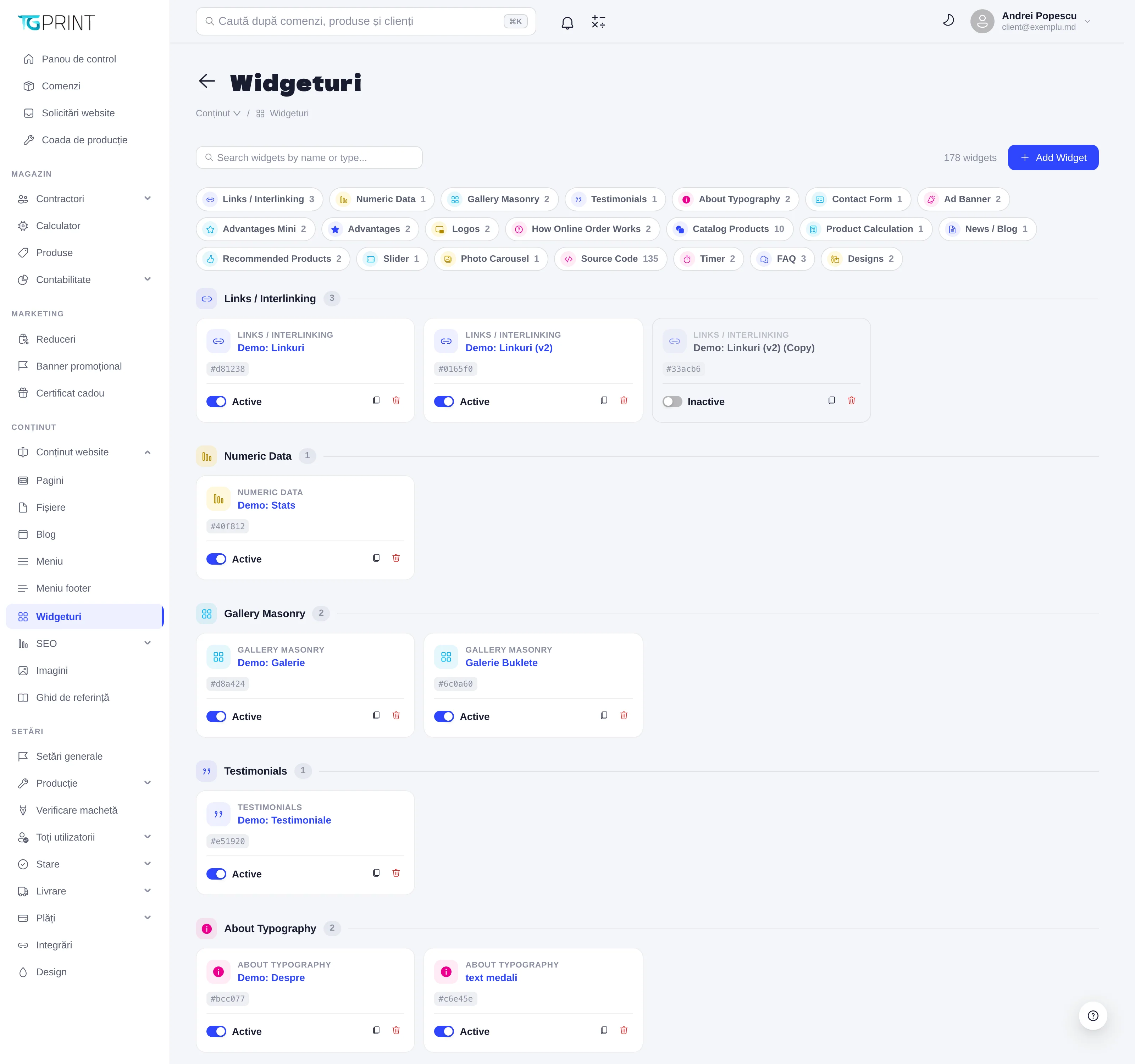
The Widgets page
At the top you have the Search widgets by name or type... field, the total number of widgets and the Add Widget button. Below them, a row of labels — one for every type that has widgets, with their count; click a label to jump to that group. The widgets are grouped by type, each on a card.
Widget types
The type is chosen at creation and cannot be changed afterwards. The available types:
- Catalog Products — a grid of catalog categories; Recommended Products — products you pick yourself; Product Calculation — the calculator of one product, with a link to its sheet; Designs — design templates.
- About Typography — a presentation of the print shop (year founded, number of orders); Advantages and Advantages Mini — lists of advantages; Numeric Data — key figures; How Online Order Works — the steps of an online order; FAQ — questions and answers; Testimonials — reviews; Logos — partner logos; Links / Interlinking — a list of links; News / Blog — articles from the Blog.
- Photo Carousel and Slider — the images from a folder in Images and files; Gallery Masonry — a mosaic gallery; Ad Banner — an advertising banner; Multi-Banner Grid — a grid of banners (1×3, 3×1 or 2×2); Картинка с текстом — image + text blocks.
- Contact Form — a contact form; Timer — a countdown; Map with Pickup Points — the map of branches and pickup points from Delivery; Source Code — your own HTML code.
Note. Source Code widgets with names such as Before Calculator — Component or Under Product Image — Component are created automatically by the platform, five per product: they are the HTML zones of the product sheet. Such a widget left empty is not shown on the site.
The card of a widget
Every card shows the type, the name of the widget (click it to edit it), a short identification code (# followed by six characters — useful for telling apart two widgets with the same name) and, where applicable, the Desktop or Mobile label.
- The Active / Inactive toggle — an inactive widget stays in the library and can still be edited, but it is not served to the site.
- Clone widget (the copy icon) — creates a copy whose name is completed with (Copy), inactive, which you can change without touching the original.
- Delete widget (the bin) — deletes the widget after the Delete this widget? confirmation.
Add a widget
- Click Add Widget. The Add Widget window lists all the types.
- Choose the type; the Create Widget page opens.
- Fill in Name (the internal name, shown in the library and in the page builder), Device type (Universal — on every screen; Desktop or Mobile — only on those screens) and Active.
- Fill in the fields of the type, the Appearance (styling + spacing) section and SEO — see below.
- Click Save. You return to the library, where the widget appears in the group of its type.
The form of a widget
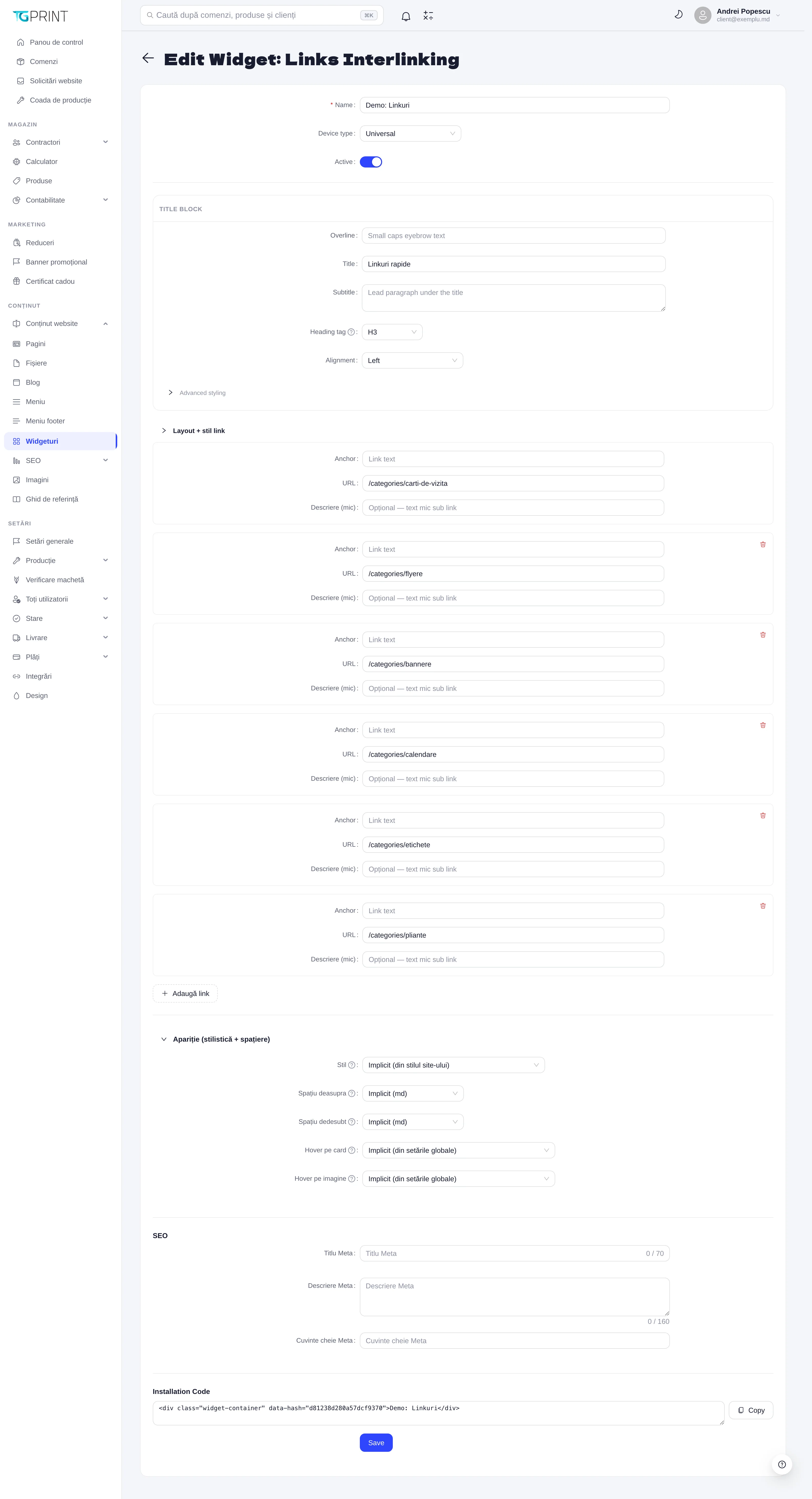
The edit form has the same structure for every type; only the fields in the middle differ. The example in the screenshot is a Links / Interlinking widget.
- Name, Device type, Active — the general data.
- TITLE BLOCK — the title of the section on the site: Overline (a small line above), Title, Subtitle (a paragraph under the title), Heading tag (the heading level, H1–H6) and Alignment (Left, Center, Right). Advanced styling reveals the alignment, the color and the size of each line separately.
- The fields of the type. On Links / Interlinking: Layout + link style (the number of Columns, the Link style — underline always, on hover or never — and the external-link icon), then one block per link, with Anchor (the text), URL and Description (small); Add link adds a row, the bin deletes it.
- Appearance (styling + spacing) — Style (Default (from the site style) or one of the visual variants), Space above and Space below (Default (md) or a fixed size), Card hover and Image hover (Default (from global settings)). The default values come from Design; change them only when you want a section to differ from the rest of the site.
- SEO — Meta Title (max. 70 characters), Meta Description (max. 160) and Meta Keywords.
- Installation Code — the HTML snippet that identifies the widget, with the Copy button.
- Click Save.
To put the widget on a page, open that page in Website Content → Pages and use Add block → Link — see Pages.