Design
The look of the storefront: the global style, the colors, the logo and the corner radii.
Updated:
Settings → Design controls how the storefront looks — with no code and no designer. The decisions taken here apply everywhere: the product pages, the cart, the sign-in, the widgets. The page is split into tabs: Site Style, Brand & Colors, Layout, Menu & Footer, Pages; each one has its own Save changes button.
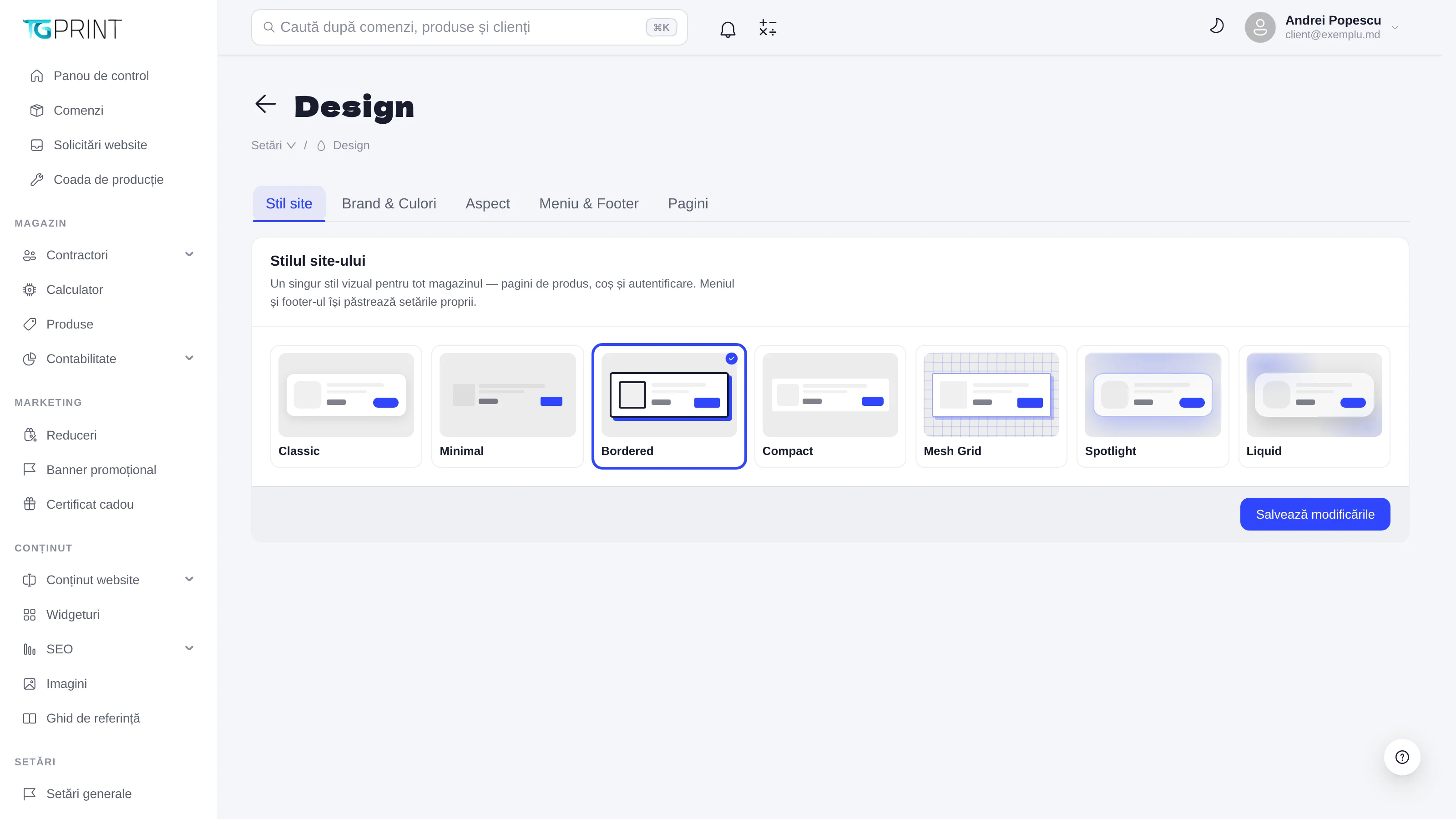
Site Style
The Site Style is a single visual style for the whole shop — product pages, cart and sign-in — chosen from Classic, Minimal, Bordered, Compact, Mesh Grid, Spotlight and Liquid. Each variant changes the cards, the fields and the buttons in the same spirit (from classic with shadows to minimal without borders). The menu and the footer keep their own settings (the Menu & Footer tab). One particular product can be an exception through Page Design Overrides in its card — see The product card.
Brand & Colors
The visual identity: Logo and favicon — the logo (PNG, JPG or SVG, maximum 400 KB; variants for a light and a dark background) and the favicon (.ICO only, 16×16 or 32×32 px recommended), chosen from the Media Library or uploaded on the spot — then the Color scheme: the main color, the accent one, the backgrounds and the text, saved color by color (Color Saved). The Default theme decides which theme the site opens with (Light or dark) for a new visitor; the visitor can then switch it themselves. The colors become variables across the whole site.
Layout
The Layout settings: Container width (px) — the maximum width of the content on large screens; Minimal lateral padding (px) — the space from the edge of the screen on a phone; Border radius (px) — the corner radius, applied proportionally to cards, buttons and fields (0 = square corners). The widgets and the product pages inherit the same radius value, so that everything looks like it belongs to one family.
Menu & Footer
The look of the menu and of the footer — their content is managed separately, in Content → Website Content → Menu / Footer Menu (The menu and the footer):
- Top Line — the thin bar above the menu (phone, opening hours, language), with its blocks.
- Menu Style and Menu Design — the visual variant; Menu Position (Top, Left, Right — as a sidebar, with Sidebar Width and Collapsed by Default); Sticky Menu (stays visible while scrolling); Menu Width (Full Width / Compact) and Menu Alignment (Start / Center / End).
- The menu colors — Menu Background Color, Menu Text Color, Menu Accent Color, with Transparent Background, Background Opacity and Background Blur for the glass effect.
- Icon Weight (Thin, Light, Regular, Bold, Fill, Duotone) and Icon Size, with their counterparts for the footer.
- Footer Style, Footer Design, Footer Background / Text / Accent Color and Footer Width.
Pages
The style of the product page (the position of the gallery relative to the price calculator, the density) and the widgets' default values (spacing, card style, hover effects), which each widget can override individually from its own form — see Widgets.
Note. Design changes are visible on the storefront immediately, for every visitor. Make the big changes outside peak hours and check on a phone: all seven styles are responsive, but colors that are too light on a light background remain the number one readability problem.